Speaking From Experience
Design Sheets // Thought Process
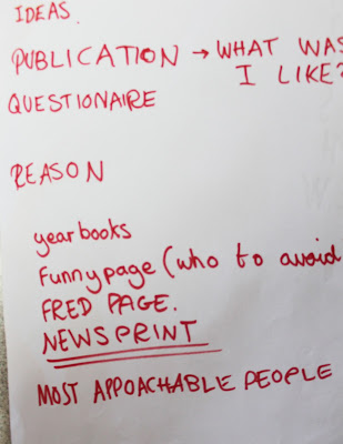
When it came to the first crit presentations in our small groups it was good to know that they liked my idea and had nothing bad to say about it only stuff I could add to it. Someone came up with the idea of having peoples facebooks near or under their portrait so if a first year wants a question answered quickly they can. I am going to select the most approachable people to be in the booklet as I wouldn't want there to be any awkward moments!

Managed to make a massive error on this questionairre. I wrote 'Comparative' instead of 'Corporative'.
So I went round this room and asked the first years whether they had been corporative this year with any of the Second years. In response to this I had 12 people saying 'NOT AT ALL' and 15 saying 'A LITTLE' and 0 saying 'A LOT'. Most people admitted to talk to the second years out side of the course. Not in the studios.
BOOKLET
I want to steer away from making another hotdog book. That and I don't think a hot dog book will be big enough for this. I want to make a simple book. One that can just be stapled together.
Band W Studio
BOOKLET
I want to steer away from making another hotdog book. That and I don't think a hot dog book will be big enough for this. I want to make a simple book. One that can just be stapled together.
Band W Studio
I found this on bandwstudio and the layout is simple. Its quite friendly too, quite a odd thing to say about a layout but when comparing it to my idea it works. The representation of the man holding the glasses in front of hgis face has elements of humor. Not to mention the yellow circle next to him which I associate with the sun, which is a warm and happy subject.
Looking at the left hand side it has elements of fear and death. You can just see the skull. This is where I could possibly add elements of humour into my booklet. We all know that staying on the right side of Fred is always a wise decision. Its something that we laugh about on the course. Get the work and done and keep fred happy! There could be a page similar to the one above. Demanding, block capital letters with Fred's face behind it? Could work and could be really effective. Thinking about this I want to content of this to really work and then keep the design simple but professional. I will try and find some reference now to express what I mean.
Bureau Bruneau
This one here is very simple but has class, I found this on design spiration.com which is a great way of finding new design or design to inspire you. I like the 'Picture This' with the simple black lines above and under it. I'm not sure but this almost looks like an introduction page to a magazine. I think Bureau Bruneau does a lot of stuff on music. Found him!
'I mainly work with printed matter ranging from visual identities to editorial design and packaging. The ideas behind my projects varies from technical to emotional concepts.
I graduated from the Graphic Design department at Westerdals School of Communication in 2010. After working at Uniform for one year, I did an intership at Sagmeister Inc. in New York. Now, I'm currently working at Bleed in Oslo' - bureaubruneau


