Arts & Crafts
1) Arts and Crafts 'Gardens'

Very simple photograph with text applied on top. Theres little you can say about a simplistic cover like this apart from it would appeal to the older generation.
2) Gardens of the Arts & Crafts Movement

This one is very similar to the book above apart from it looks very dated. This book looks like is was made in the early nintys. Theres something about the faded and de-saturated photograph that says that to me. I think this is because this photograph was taken with film when the other one was taken with a digital camera. The text looks dated too. However, the cover does suit the book and what the book is set out to do and thats to appeal to an audience and show simply what the content of the book is going to be about. Again, this book would be targeted at the older generations (belongers)
3) The Complete Book of Arts & Crafts

The complete book of arts and crafts, clearly aimed at small children. You can tell this from the amount of colour used and the cartoon illustration there enjoying painting. I remember as a child I never paid any attention to what the text was telling me but only the pictures.
4) Arts & Crafts Movement

Pretty boring cover, yet its to the point, its legible and conventional for the content. The title is clear and so are the sub headings and extra text. the pictures on the cover are there to give you a sneak preview of the content. aimed probably at 16 years plus for people interested in art and its movements
5) The Arts and Crafts Busy Book
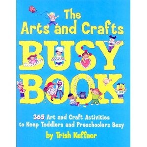
Another child's book here. Starting with colour there are only a few and they both appeal to girls and boys Even thought the blue is dominating theres something about the little bits of pink that seem to stand out alot. The 'busy' suits the manic of all the people surrounding the cover, all having fun running about and drawing. Any child that looked at this wouldn't be interested in the text but only the imagery
6) ART: The Whole Story

Well, aimed at people who are interested in art and want to know 'the whole story'. the painting, called 'Son of Man' (1964) is a very popular painting and is because of this is something people can respond to and connect with. The cover is simple and well laid out. The title works very well on the man figure in the painting and the text in the left and right top corners are work well in terms of layout. With a painting on a cover you never want to obstruct it with any unnecessary text or extra imagery.
7) The Art Book

The art book is a very famous book and I'm guessing could be similar to 'Art the whole story'?. I don't know but this book is about art in general, art throughout the ages. Aimed at people who are interested in art. More to the point this would be perfect for people interested in the history of art. I am not a fan of this cover, its text based and is pretty much saying this is creative, art is creative. However it is legible and you understand what the content will be about. You couldn't imagine this cover with this same text but in a normal type face like helvetica, that would be extremely boring.
8) Lets Make Some Great Art

I like this cover, the colour, imagery and text work so well for me. VERY strong conventions with art, apart from the bird. I don't know what he's doing there. However the Mona Lisa is in the bottom left corner and she (the painting) happen to be one of the most or the most famous paintings to date in fine art/ art. Then the little pencil there, which is obviously a tool in creating a drawing or picture. I really like the text in this. It looks like it has been painted with a brush which then again has conventional conventions with art and fine art. I believe that this book publication would be aimed at teens and above, for some reason I think this book looks like it might be quite humorous. It looks playful and fun to read.
9) The Art Book For Children

Playful type but for a child I think this would be quite difficult to read, depending on the age of the child obviously but this book looks as if its aimed at children 6-10? I think in order to create a book for children theres need to be playful imagery as thats normally all they are interested in!
10) Art for Young People

The book of art for young people..rubbish title and name. How young is young exactly? This book looks almost to mature for a young person. Fair enough if this young person is 18-25, because you can class that as 'young' however. They would be interested in a book to do with art! They don't need this book to say for young people. It takes away the overall quality of it. If its for REALLY young people then the cover isn't right. this wouldn't appeal to a child audience or very young teen.
Culture
(bad quality reference)
1) Culture and Climate Change// Recording

Quite a bland and boring cover, straight to the point though and is readable and legible. The 'Climate Change' relates with the colour blue and when we think of climate change we think of rising sea waters. Down the left hand side of the book you have a selection or people who have something to do with the book. This book is directed at only people interested in this area, I will try and phase it better, only a small percentage of people will go on to read this and the book doesn't need a loud front cover as its not trying to appeal to the whole mass.
2) Corporate Culture and Performance
This cover reminds me of the greeks, the background looks like marble. I can't say a lot about his book, other than it looks like a hard read!
3) Change the Culture, Chang the Game

The first time I looked at this cover I read game and then noticed that the cover itself is like a game. Think of a table tennis table or a tennis court and look at the cover again. The middle of the book adds two sides to that book and I instantly thought of this.
4) Cultural Theory and Popular Culture
The red and black generally connotes death and darkness, danger, pain. But I doubt that this book is about this. Thinking again this book could be quite a serious one. Judging byt the huge block capitals. Colour is interesting too. The black text reads 'Theory and Culture' and the red ' Popular culture.
5) Leading in a Culture of Change
The singular man standing on a needle is possible your life in your culture and the point of him standing on a needle could be suggesting how small and insignificant we are in this world or just our culture. This book would be open to anyone who wants to learn more about about themselves.
6) Culture, Communication & Nursing
This one isn't boring, well it is but its a a lot better than the other ones. The illustrations in the front say a lot about the book. The two heads facing each other and then the symbol that we have grown to relate with sound work perfectly in relating with the title. The nursing part of it works to, not only is the blue a stereotypical colour for boys but also is associated with health and good being. The pink, stereotypical for girls, and also a calm colour.
7) Riding the Waves of Culture

Dull cover , Riding the waves of Culture. Very simplistic and to the point. This book is probably about you in your modern culture. I would say aimed at the older generation.
8) Ideas can be dangerous

This design is nice and works well with the book content. Our society today has become to realise that the yellow and black stripes mean 'Danger' or 'Warning'. The 'Culture' at the top ( therefore the title) is split in two which seem a bit pointless to me but anyway I quite like it. I thought it was CUL-TURE not CULT-URE. Unless this book is to do with the ideas cults have and how they are dangerous?
9) Culture
A book on culture! Thats all I can get from this rubbish example. The hand might be suggesting stop? or a book about rules? What you are aloud to do in a modern day culture?
10) Culture to Catwalk

Culture to Catwalk. I book about fashion and the catwalk. The cover as a total of three female model representations. The book is split up into the rule of three. Audience would simply be people interested in fashion and the catwalk, mainly a female audience. The representations on the cover is what would attract them to this book.
Conclusion for Culture
Culture is a subject where almost anyone can get involved. Its something you need to know about, especially you own one. However I find that in general the book seem very bland and boring, Almost the book is just getting straight to the point and not bothering with appearance. I'm not saying this for books about culture in general, this is my own subjective comment that is probably wrong. To be honest my example 6 & 8 work really well in communicating the audience what the book is about just through the image. When books like example 1, just don't say a a lot at all. Theres a saying 'don't judge a book by its cover'. I think i'm starting to realise that graphic designers don't take this in to hand. its all about the cover and its design.